

Asset allocation is easier to understand when investors can see both the detailed holdings structure and the broader groups behind it. When those details are spread across several charts and tables, however, the overall picture can be difficult to scan.
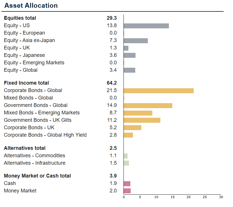
The new Asset Allocation Breakdown Chart in TopSheets brings detailed asset classes, their master asset classes and optional group totals into one clear visual for automated fund factsheets.
One chart for grouped asset allocation data
The chart groups detailed asset classes under the master asset classes you select. For example, a report can present equity, fixed income, alternatives and cash as separate sections while keeping the underlying allocations visible within each group.
You control which master asset classes appear and the order in which they are displayed. A total can also be shown for each group, with an editable label that fits the terminology used in your report.
Because the groups share one horizontal scale, readers can compare allocation values across the complete chart instead of interpreting several separate visuals.
Control what the chart shows
The Asset Allocation Breakdown Chart can be adjusted to match the structure and layout of your factsheet. Its settings include:
- the master asset classes to include and their display order;
- optional totals for individual groups and a customizable total label;
- the value shown by the chart;
- sorting of the detailed asset classes;
- minimum and maximum values for the horizontal axis; and
- page-break behavior for longer allocations.
These options make it possible to keep the chart focused on the information that matters for a specific strategy while preserving a consistent presentation across reporting periods.
Why grouped allocation matters in investor reporting
A single allocation number rarely tells the full story. Investors may need to understand not only how much of a portfolio is allocated to fixed income, for example, but also how that exposure is divided among government bonds, corporate bonds and other categories.
Showing both levels in one chart gives readers context without forcing them to move between separate sections. Group totals provide a quick overview, while the detailed rows explain what contributes to each total.
The dedicated chart can also simplify template maintenance. Instead of assembling the same view from several charts and companion tables, reporting teams can use one control with a shared scale and centrally managed settings.
Use the chart in a repeatable factsheet workflow
The chart is designed for the same repeatable reporting process as other TopSheets components. Once it is configured in a template, the selected structure and display settings can be reused as the underlying factsheet data is updated.
In the program’s Asset Class Exposure section, each row can be assigned to an asset class and supplied with Weight, Return Contribution and Result values. The chart can display the selected value according to its template settings.
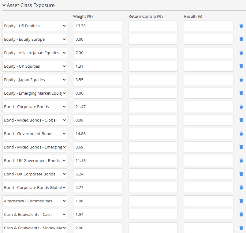
This helps teams present portfolio structure consistently without rebuilding the allocation section for every reporting cycle. The result is a clearer report for investors and a more manageable workflow for the people producing it.
Learn how to configure the chart
For a concise description of the available Asset Allocation controls and settings, see the Asset Allocation charts and table article in the Fundpeak Help Center.